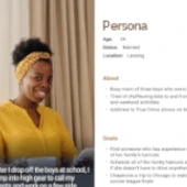
We can pinpoint your primary users, find out what they really need from your site, and test that it is delivering results. We have experience with personas, competitive analysis, user journeys, iterative design, and user testing.
Let us create a BigCommerce store for you! Whether you are transferring from another platform or starting your first online store we want to help you succeed.
Our designs are customized to match your brand and are always responsive. Your site will be beautiful and accessible on every platform from mobile phones to tablets to PCs.
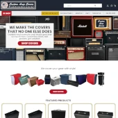
BigCommerce UX, Design and Development for Tuki Covers and Custom Amp Covers
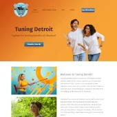
Small business UX, Design and Development for Tuning Detroit
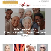
Small business UX, Design and Development for Mobile Cuts and More
Small business UX, Design and Development for Knowledge Action Success
UX Research and Design Project
Figma and HTML/CSS Sample Landing Page For Recruiting Agency
Stephanie Nagy has over 20 years experience in UX and programming has been a certified BigCommerce partner since 2015.
Her tech skills include full stack development, Extreme Programming, agile workflow, test driven development, React, and Laravel.
She has worked at Coalition Technologies as a BigCommerce developer and currently works at Menlo Innovations as a developer and High-Tech Anthropologist® (UX/Business Analyst)
We are passionate about user experience and love to dive into complex problem statements, personas, user journeys, iterative design, usability testing, and working with developers to bring a project to completion.
We can overhaul your current site, design something completely new, and add javascript for custom functionality.
We will work with you to get you a fair price for your work, but we will never overcharge you. If your job comes in under our estimate we will only charge you for the amount of work that we do.
2020/2021 - Timeline: 8 months
Tuki Covers and Custom Amp Covers are related sites owned by the same parent company that offer covers for musical equipment. Tuki Covers are padded, more durable, and available in black only, whereas Custom Amp Covers offers lighter dust covers in many colors. Both companies offer the option to special order a custom cover if they don't have the correct model in stock.
Custom Amp Covers and Tuki Covers are hosted on the BigCommerce platform and needed to upgrade to the internal Stencil framework. We took this opportunity to redesign both sites. How could we help customers find the correct cover at one of these sites?
The personas were developed by working with the owners of Tuki and Custom Amp Covers based on their customer profiles. We've worked with Custom Amp Covers for over 15 years and used our knowledge of the amp cover industry to help narrow down their target personas.
The target persona for Tuki Covers is a professional musician who needs durable covers to protect his gear travelling to gigs.
The Custom Amp Covers target persona is a hobbyist builder with a large collection of amps.
Tuki Covers and Custom Amp Covers have three main competitors:
In general, large online music stores and most amp manufacturers sell a less expensive, but less durable cover. They run sales promotions and offer free or reduced shipping, but they have a much smaller selection with hundreds of covers. Larger stores don't tend to offer padded, customizable or custom made to fit covers.
Only a few custom boutiques offer the same level of selection as Tuki Covers and Custom Amp Covers. Many of these sites are outdated or have UX flaws such as horizontal scrolling, non-responsive design, custom order forms without math error checking or units of measurement, not showing photos for individual products, poor search capabilities, or no way to purchase products on the site.
Learning from the the other sites analyzed, we implemented the following:
For both stores we decided to simplify the top navigation headers. The previous headers had too much information and it wasn't clear what all of the categories meant. All of the shopping categories were moved into the Shop mega menu and all of the custom orders were moved under Get Free Custom Quote
Custom Amp Covers before and after header sections highlighting reorganization of categories and sub-categories
Tuki Covers before and after header sections highlighting categories moved to the Shop mega menu
The Hero sections for both stores had competing fonts, outdated graphics, and visual clutter. We decided to use a single hero image with a Call to Action leading to the Shop All section customized for each store.
Custom Amp Covers Hero Section before and after redesign. The redesign is crafted from royalty free photos featuring a variety of vintage amps to appeal to the Jackson Parnell persona.
Tuki Covers Hero Section before and after redesign. The redesign features an image of a professional musician performing to appeal to the Joe Ash persona.
Instead of redirecting to a new page when clicked, we updated the product options to open large lightbox images on Custom Amp Covers product pages.
Lightbox images
It was difficult to find the correct custom form on the Custom Orders page before redesign because equipment was listed by name only. In the redesign, we used clear instructions with steps, infographics, diagrams of the equipment, and photos of the covers to help customers find the correct form
Text only descriptions before redesign
Instructions with steps, infographics, equipment diagrams, and product photos after redesign
Users were asked to complete the following journeys:
The main discovery from testing was that there should be more places that explicitly call out that customers can order a custom cover if they don't find their make and model. This should be on the home page, each product page, the drop down search results, the search results page.
A positive feature was the error messaging to catch math errors when filling out dimensions on custom forms. Users liked the clear messaging and instant feedback before clicking submit.
Error messaging when numbers don't add up correctly
Choosing both a pocket and a bottom covering was confusing. The radio buttons for the entire section are mutually exclusive, even though some are grouped together with outlines. Users chose the pocket option, then chose the bottom covering option, which deselected the pocket. They did not see there was a third radio option to add both a pocket and a bottom covering. The original intent behind this design was to offer a discount offered when both a pocket and bottom covering were chosen, but this offer was discontinued. We came up with a few redesign options for the next round of user testing.
Current radio buttons were confusing
A redesign changes the radio buttons to include only the pocket options and uses a checkbox for the bottom covering.
Changing the bottom covering to a checkbox instead of a radio button
Next steps would include...
Tuki Covers and Custom Amp Covers use a customized version of the BigCommerce Vault theme. We used JavaScript to add image lightboxes, to customize the product pages for added functionality, and to create custom packing slips and invoices.
2021 - Timeline: Less than 1 month; Ongoing support provided
Tuning Detroit is a website for biofield tuning practitioner Pam Bowerman. Biofield tuning uses the therapeutic sound and vibration of tuning forks to rebalance the body's energy field. After listening to a podcast about biofield tuning, Pam was inspired to become a practitioner. I met with her to discuss how a website would help achieve her business goals. How could we help her clients to learn more about biofield tuning and to make an appointment?
After speaking with Pam, I learned about Tuning Detroit's competitors and did further research into the field.
After considering the sites that were analyzed, we decided on the following:
Pam described the target persona for Tuning Detroit as adventurous and curious person who is interested in alternative health treatments. We came up with Samantha Cooper, who heard about biofield tuning from her friend and wants to try it for the first time.
After conversations with Pam about her brand identity, I designed the Hero section for Tuning Detroit with a custom image created by adding tuning forks in the hands of two people smiling and having fun.
Tuning Detroit hero image
The page design was completely custom and built using Oxygen for WordPress. It includes a home page, biofield tuning, faqs, contact, and scheduling. The site is responsive and usable on any device at any resolution or size.
We discussed the tasks that our persona Samatha should be able to accomplish on the site and came up with a list to test with users. We chose informal testing with 3 friends/family members. Testers were able to successfully answer the following questions:
Feedback from user testing showed that a next step could include adding prices for services to the FAQs page. Finding the price for a service was the most challenging task. It was available on the home page, but further down below the fold, and also was available on the scheduling page, but multiple users checked the faqs page for pricing.
Tuning Detroit uses a completely custom theme created with Oxygen for WordPress. We integrated scheduling with Acuity to be embedded in the site so that users retain trust by not leaving the site to make an appointment.
2020 - Timeline: Less than 1 month; Ongoing support provided
I've known Ashleigh Jimenez for years as our family's hairdresser. When Ashleigh started talking about opening her own business as a mobile barber and hairdresser in 2020 I offered consulting, UX, and web development services pro bono to help her begin her new venture. Ashleigh wanted the focus of Mobile Cuts and More to be on serving families and senior citizens. We wanted a site that was easy to use for busy families as well as senior citizens who might not be as technically savvy. The site would also need to explain how it works to get a haircut at home. We needed to consider what equipment Ashleigh would need to bring in and what responsibilities the client might have in terms of pre-visit hair care and providing a setting for Asheligh to work. We also needed a clear Covid-19 policy to let clients know what was expected to protect their safety and Ashleigh's. This site was created on a tight budget to respect Ashleigh's business plan. How could we help inform her clients about mobile haircuts and help them schedule an appointment?
I research the competitive space to learn about mobile hairderssing and shared the findings with Ashleigh. Mobile Cuts and More's competitors are other mobile hair cutting businesses that:
Learning from the the other sites analyzed, we implemented the following:
For the Mobile Cuts and More website, we chose a premade theme for hairdressers to fit Ashleigh's budget. I handcoded changes to the theme and reworked the template using php files for the header and footer to make them reusable for every page. We used free stock photos from Unsplash and Pexels.
In 2021, Mobile Cuts and More had gained clientele and become busier. Ashleigh realized that her target client had changed more from families to senior citizens. Ashleigh sent me a new image of senior citizens to replace the original hero image of families. The busier Ashleigh was, the less time she had to book appointments by phone. We looked into adding scheduling to her website and decided to use Square's built in scheduling because they were already her payment provider. I added large calls to action throughout the site to tell clients they could book an apopintment through the website if they lived within certain cities.
The original target persona for Mobile Cuts and More was a busy mom who is looking for a way to quickly and easily get her entire family's hair cut at the same time. As Mobile Cuts and More grew, Ashleigh found that her customer base changed from families to senior citizens. The target persona changed to Rose Murray, a senior citizen in a nursing home.
Busy mom Shondra Crawford
Senior citizen Rose Murray
The original Hero section for Mobile Cuts and More is an image of a family to target the Shondra Crawford persona.
Family hero image
The updated Hero section for Mobile Cuts and More is a diverse image of senior citizens to target the Rose Murray persona.
Senior citizens hero image
The page design was built using a purchased theme that I then highly customized with hand coding. Pages include the home page, contact, faqs, a gallery of photos of real clients showing the services Ashleigh offers, pricing, and an about page. There is a link in the header for the Covid-19 policy that directs to the Covid-19 section on the faqs page. The scheduling feature opens in a new page. It would be preferable to allow users to stay on the Mobile Cutws and More site when booking an appointment, but we decided that the free scheduling feature offered by Square that opens in a new page fit better with Ashleigh's budget. The site is responsive and usable on any device at any resolution or size.
We discussed the tasks that our persona should be able to accomplish on the site and came up with a list to test with users. We chose informal testing with 3 friends/family members and included a senior citizen. Testers were able to successfully answer the following questions:
Feedback from user testing showed that next steps could include...
Mobile Cuts and More uses a purchased theme. We handcoded php files from the original HTML theme to create a reusable header and footer for the site. We integrated scheduling with SquareSpace.
"Stephanie is Amazing at what she does!!! I am incredibly happy with my experience working with you on my website you have had so much patience with me as I didn’t completely know what I wanted for my design and I appreciate all of the suggestions, ideas and examples that you have given and shown me. I love the way everything turned out even better then my expectations!!!"
ASHLEIGH JIMENEZ
2020 - Timeline: 2 months; Ongoing support provided
Knowledge Action Success is a website for business and personal success coach Steve McClain who is also starting a career as an author. The impetus for developing a website was Steve's desire to offer classes where clients can register and pay online. He also has a book coming out soon and a podcast that he would like to promote. The website would also support private coaching clients in finding out more about his coaching style and contacting him to set up a session. Steve offers a free introductory call to new clients so we wanted that to be prominent on the site. How can we help Steve's clients book a session or learn about his coaching, classes, podcasts, and new book projects?
Steve had a few coaches that he personally followed and liked the layout of their sites, and a few that he did not care for. I researched the business space and the sites recommended by Steve. Knowledge Action Success's competitors are other business and life coaches. Here is what we learned about the competition:
Steve and I discussed which pieces he wanted to offer on his site. We considered what we learned from the sites we analyzed to begin to write copy for the site. Instead of writing completely new copy for the site, which would have many pages, we leveraged the content from Steve's two podcast series. Steve is very personable on air and had a goldmine of great information that could be repurposed into copy for the website. I used a tool to transcribe Steve's podcasts and used that to guide how we wrote the copy for the website with Steve editing and refining afterward. We ended up creating:
After discussions with Steve, we found the target persona for Knowledge Action Success is an entrepreneur who is serious about starting or growing a business. He listens to podcasts, takes classes, and is constantly on the lookout for ways to engage his clients or customers.
The target persona for Knowledge Action Success is an entrepreneur who is ready to to take his business to the next level.
The Hero section for Knowledge Action Success is a custom image created by adding two backpackers looking out over the precipice of a mountain range.
Knowledge Action Success hero image
The page design was completely custom and built using Oxygen for WordPress. Discussion's with the client informed the Knowledge Action Success brand to use powerful blocks of red and black. The site includes a home page, coaching, podcasts, classes, books, blog, about, and contact pages. I worked with Steve to implement a shopping cart on the site to allow clients to register and pay for classes which we will bring back in when he is ready to offer classes.
We discussed the tasks that our persona should be able to accomplish on the site and came up with a list to test with users. We chose informal testing with 3 friends/family members. Testers were able to successfully answer the following questions:
Feedback from user testing showed that next steps could include...
Knowledge Action Success uses a completely custom theme built using Oxygen WordPress. The site includes custom post pages to highlight the Knowledge Action Success podcasts and a WooCommerce integration to pay for classes.
2023 sample landing page created over a weekend
I used a prompt to create a Figma design and HTML/CSS implementation for a landing page for a recruiting agency.
2022 - Timeline: 3 months
I have been a member of a small virtual book club focused on anti-racism for a few years. Our members met during the breakout sessions for a seminar on anti-racism and we decided to keep meeting monthly to learn more about the topic. Some of us use ereaders and some read physical books.
Small face-to-face virtual book clubs facilitate close friendships and in depth study of a topic, but they lack some of the benefits of large online book clubs with apps. I wanted explore some of the benefits of larger groups and see if there are ways that members who read digital books can share notes with members who read physical books.
How might we enhance a social justice virtual book club with the following?
I looked at a few competitors in the online book club space to learn more about what works and what doesn't work in this domain.
Reese's Book Club App and Bookclub.org are competitors in the online book club space.
Areas where current virtual book clubs succeed:
Areas of improvement for current virtual book clubs:
Based on research and interviews with members of my social justice book club, the target persona was developed as a retired woman who is an active volunteer in her community.
Janet Bradford is the persona for a social justice virtual book club. She is retired, enjoys reading, and is active in her community as a volunteer.
Some brainstorming techniques I used were Mind Mapping, Affinity Diagrams, and Card Sorting
The Mind Map highlighted similarities and differences between large and small virtual book clubs.
Mind Map
An Affinity Diagram helped to narrow my focus for the journeys that might be accomplished with the app. I decided to concentrate on communication between members, making a difference, and sharing information between readers with digital and physical copies of their books.
Affinity Diagram before sorting
Affinity Diagram after sorting
I did both an open and a closed card sort to dive deeper into how to group the information in the app into categories. The open sort was difficult for users, but the closed sort confirmed my general categories made sense to users: Book Club, Give Back, Books, Manage My Booksm and My Account
Card Sorting Topics
Closed Card Sorting Results Matrix
I used a variety of testing, but found the most useful results from A/B testing, user testing with a clickable prototype in Axure, and an expert evaluation.
Users were asked to complete the following journeys with the clickable prototype:
Next steps would include...